Information Design Projects
Chronological
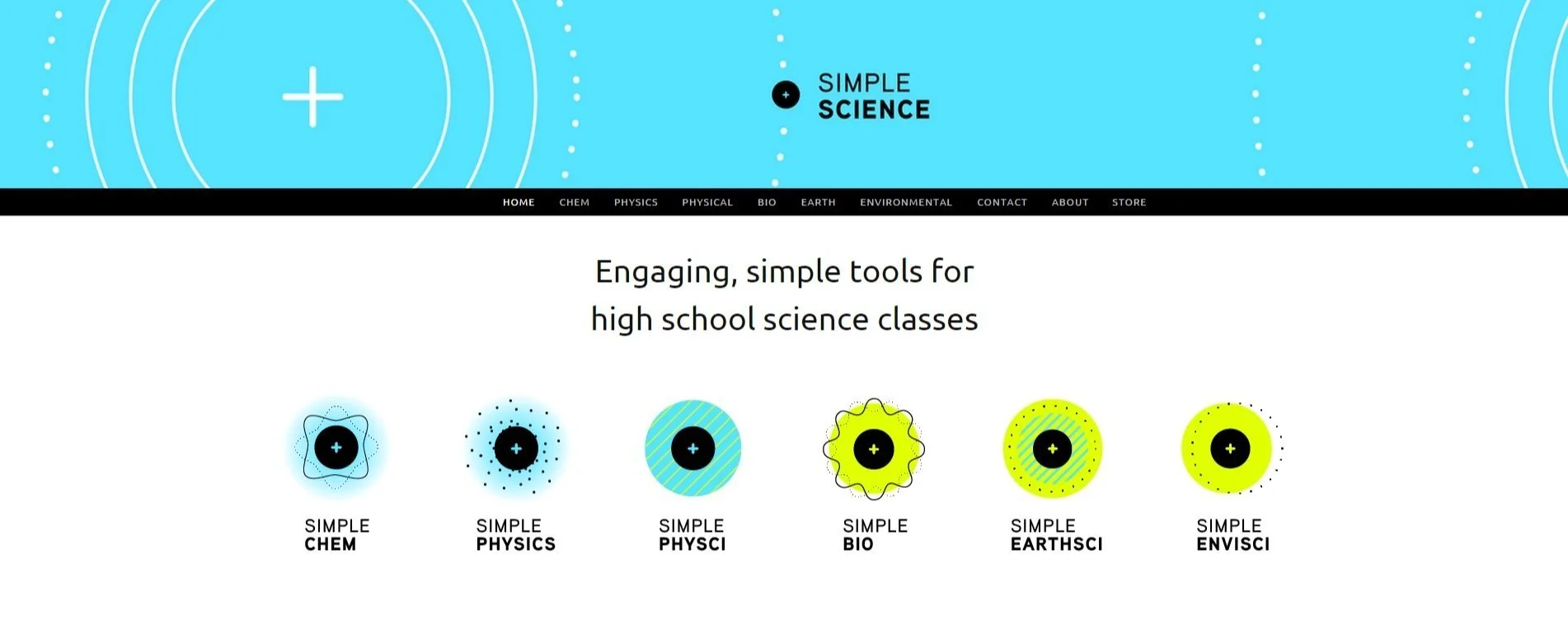
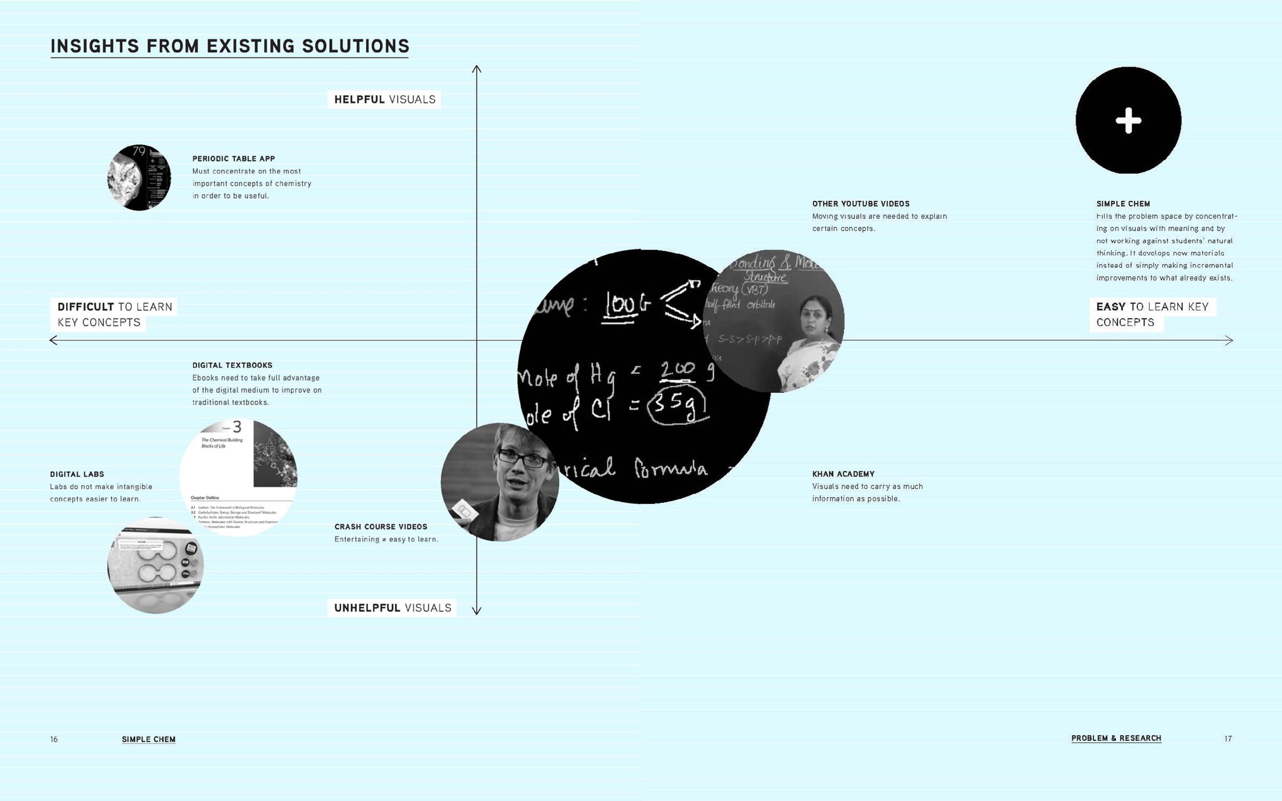
Simple Science
Two-year thesis project for Academy of Art University, completed 2015. Won the President’s Award and was given a top spot at the Spring Show, in large part because of this project.
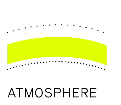
Developed new models for visualizing atomic structure
Created a printable set of mini cards for approaching stoichiometry like dominos
Designed an app to gamify stoichiometry + make it more tangible
Created a physical kit of constructible atoms that magnetically “bond” to each other
Designed digital + printable assets for high school science teachers + developed a website to host them


Check out my process book for more details:


Real Estate Education
Hundreds of visual resources + custom icon library for courses offered in all 50 states.
Covered property definitions, contracts, financing, agency, and everything else covered in real estate licensing and post-licensing courses.


Hormones Made Fun
Hand-drawn diagrams for long-time client Nicole Jardim’s book Fix Your Period, published by HarperCollins.
(Cover design not mine.)


Circular Astrological Calendar
Created as a summer solstice celebration for clients, the calendar doubles as a DIY flower-petal-sticker mandala.
The solstice begins the year at the 12:00 position and continues clockwise through the seasons.
A modified concept of this award-winning design.


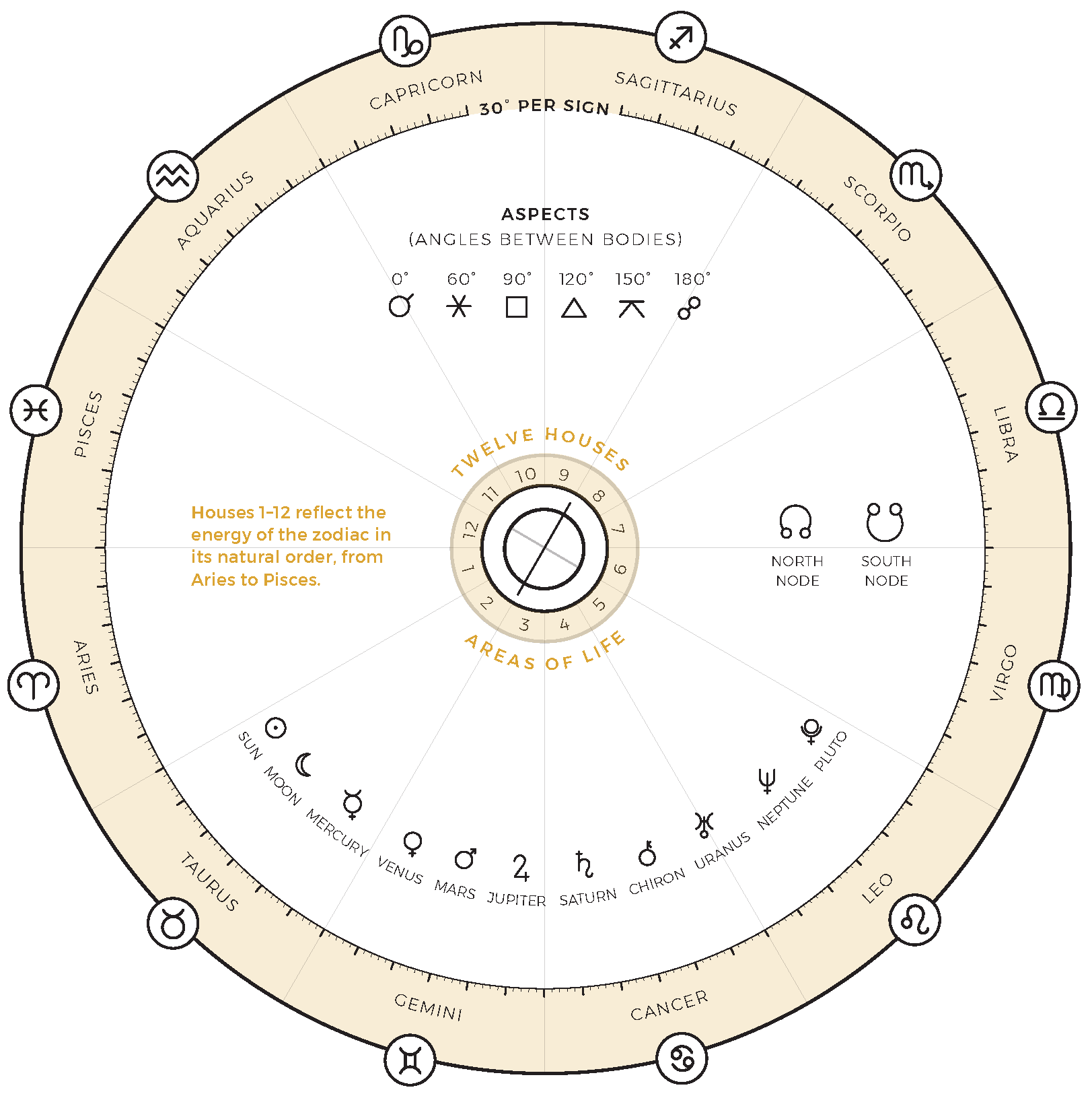
Re-Charting Astrology
Precise diagrams and custom icons for Jennifer Racioppi’s book Cosmic Health, touted as “spiritual wellness grounded in science.” [1]
(Cover design not mine.)


Tasting Notes as Label
Collaborative info-design-meets-branding with UC Berkeley aerospace engineer turned independent bottler. Tasting notes for each spirit are mapped onto the label, indicating source and intensity.
Designed for letterpress; only one new plate (blue) would be required for each release.

Photo via Pekut & Carwick Instagram.


